
usability for annual reviews: prep that builds trust
review prep, simplified
show what changed, surface the key docs, prompt better questions
Annual reviews are one of the highest value moments in wealth management. They are also a moment where people can feel exposed: unsure what has changed, unsure what questions to ask, unsure what decisions they need to make. A digital wealth experience can either reduce that anxiety or amplify it by presenting data without direction.
Great annual review ux turns the experience into a preparation tool. It helps people arrive feeling informed, organised and confident.
1) make “review prep” a clear entry point
Do not make users assemble the story themselves.
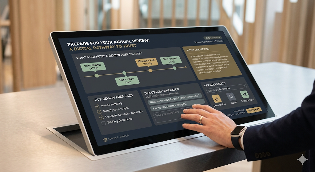
patterns that work
a review prep card or page: “prepare for your annual review”
a short checklist of what to look at before the meeting
quick links to the most relevant areas: performance, net worth, documents, messages
If there is an obvious prep pathway, users follow it. If there is not, they wing it.
2) summarise what changed, not just what is true
People care about change because change drives discussion.
include
headline change over the period: value change, contributions and withdrawals
allocation movement at a high level
major events: new accounts, closed accounts, large inflows or outflows
a simple “what drove this” summary where possible
Keep it scannable. The experience should feel like it is doing work on the user’s behalf.
3) build a question-friendly experience
People often do not know what to ask. Help them generate better questions without making it feel like homework.
lightweight prompts
“what do you want to achieve this year”
“has your income, expenditure or liabilities changed”
“do you need to adjust risk, liquidity or time horizon”
Prompts should be optional. Never force a questionnaire.
4) make documents review-ready
Annual reviews often revolve around documents. People need to find the right items quickly.
document ux that supports preparation
a dedicated annual review filter or collection (eg “this year’s key documents”)
clear naming and predictable categories
fast download and share behaviours
confirmations that reduce uncertainty: “downloaded” “saved” “sent”
If documents are hard to locate, users show up unprepared or ask for re-sends.
5) connect messaging to preparation
Messaging is the glue between preparation and the meeting.
patterns that work
a “send a note before the review” prompt
suggested topics such as “cash needs” “life changes” “risk comfort”
the ability to attach a document or reference a figure easily
clear expectations on response times
This reduces last-minute surprises and improves meeting quality.
6) keep the experience calm and printable
Annual reviews are high attention moments. Avoid noise.
design moves that help
a clean summary view with clear hierarchy
limited charts, only where they clarify the story
a shareable or printable review summary, even as a simple pdf export
People want a coherent narrative they can scan in minutes.
7) show data confidence and freshness
Preparation fails when users do not trust the data.
include
as at dates and last updated times
clear cues for what is user-provided vs provider-confirmed where relevant
gentle nudges when something is missing or out of date
Transparency builds confidence.
closing thought
Annual review ux is about reducing uncertainty. If the experience helps users understand what changed, gather the right documents and arrive with clear questions, the meeting becomes more productive and the relationship feels stronger.