
financial data visualisation for wealth platforms: charts clients actually trust
charts you can actually believe
make every chart answer one clear question, show context like timeframe and currency, then keep comparisons optional and consistent. avoid trust breakers like weird axes and mismatched rounding. always pair visuals with a quick summary or data view so clients can verify the truth fast.
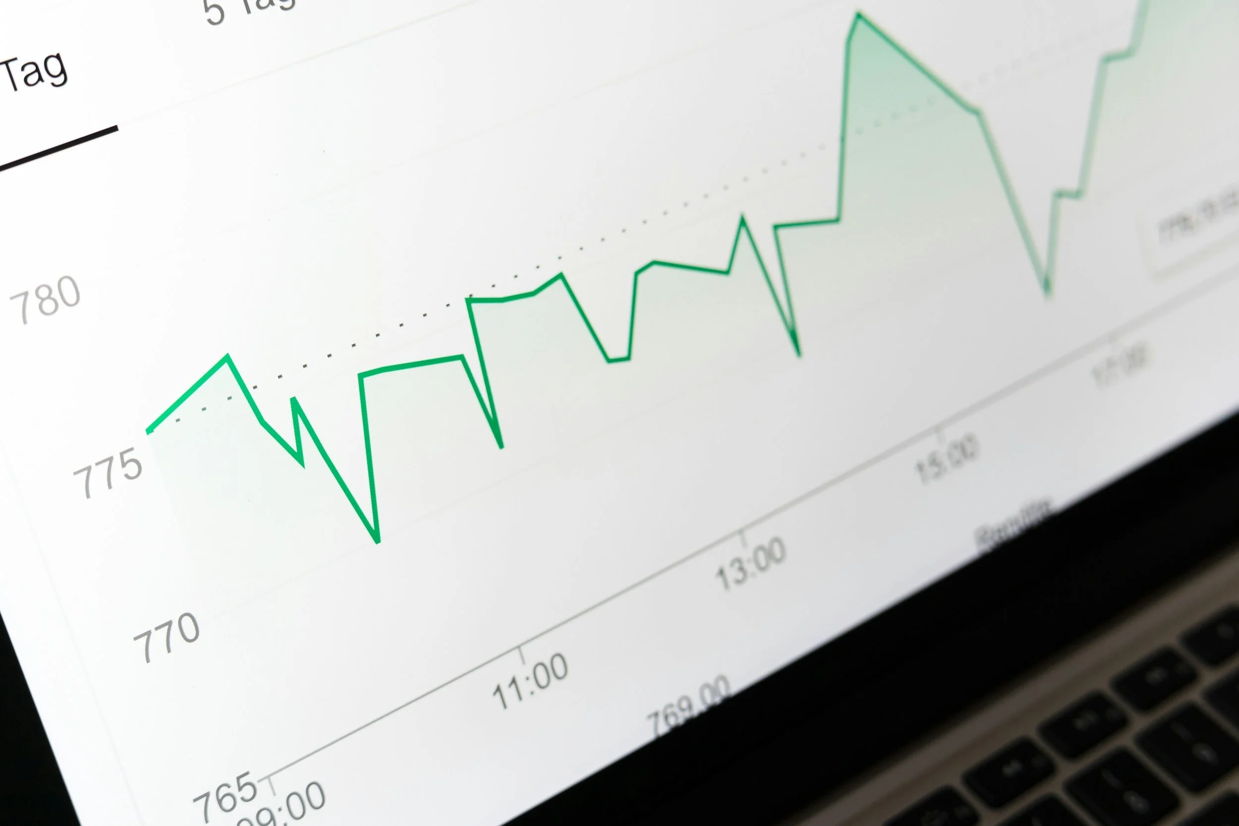
Charts in wealth platforms are not decoration. They are evidence. Clients use them to confirm reality: what they own, how it is performing, how it is allocated and what has changed. If a chart feels unclear, inconsistent or too clever, clients will default to doubt. Doubt becomes distrust.
Great financial data visualisation makes complex information feel calm, legible and verifiable. The goal is simple: clients can understand the story quickly and check the numbers when they want to.
1) start with the question the chart answers
Every chart should have a job. Name it clearly.
Examples:
“portfolio value over 12 months”
“asset allocation by class”
“net worth breakdown”
Avoid vague titles like “overview” or “insights”. If the client cannot predict what they will see, they will not trust it.
2) make the context unavoidable
Charts without context feel like marketing.
always show
timeframe and as at date
currency and units
whether values are estimated or confirmed
what is included and excluded, especially across multiple accounts
Small labels create big trust.
3) keep comparisons consistent and optional
Clients like comparison, but only when it is understandable.
patterns that work
one primary view per chart, with optional compare toggles
consistent colours for the same meaning across the product
clear legends that do not rely on colour alone
Never force a benchmark or peer comparison. Make it an intentional choice.
4) avoid the three common trust breakers
These three patterns quietly destroy confidence.
trust breakers
axes that exaggerate or flatten the story without explanation
unexplained rounding differences between chart and table
charts that change meaning when you switch timeframes or filters
If the same portfolio value appears differently in two places, the chart loses.
5) use progressive disclosure, not visual overload
Wealth data gets complex fast. Your job is to stage it.
do this
start with a summary view that is easy to scan
let clients drill down via tap, expand or filter
show details on demand, not all at once
Dense charts feel like work. Calm charts feel like service.
6) tooltips should add meaning, not just numbers
Tooltips are your chance to remove ambiguity.
a good tooltip includes
date
value and percent where relevant
labels like “portfolio” “benchmark” “cash” not just colours
a short explanation when needed, such as “includes dividends”
If a tooltip forces interpretation, it is not doing its job.
7) always pair charts with a verifiable alternative
High-trust visualisation gives clients a way to check.
Examples:
a mini table of key values
“view data” links
a short summary: “up 3.1% over 6 months”
This is the difference between pretty and trustworthy.
8) accessibility makes charts more credible
If charts are inaccessible, the product feels fragile.
baseline expectations
keyboard access to toggles, filters and time ranges
text summaries that explain the story
no reliance on colour alone
a data alternative for key values
closing thought
Charts clients trust share one trait: they make the truth easier to see. Clear titles, clear context, consistent comparisons and verifiable numbers turn visualisation into confidence. If clients can understand the story fast and validate it easily, the chart becomes part of the relationship.