
authentication ux for wealth apps: 2-step verification without the rage
Authentication is the front door to a wealth platform. It is also the fastest way to lose trust if it feels confusing, unreliable or overly punishing. Clients accept strong security. What they do not accept is uncertainty: codes that do not arrive, unclear instructions, random prompts and dead ends when something goes wrong.
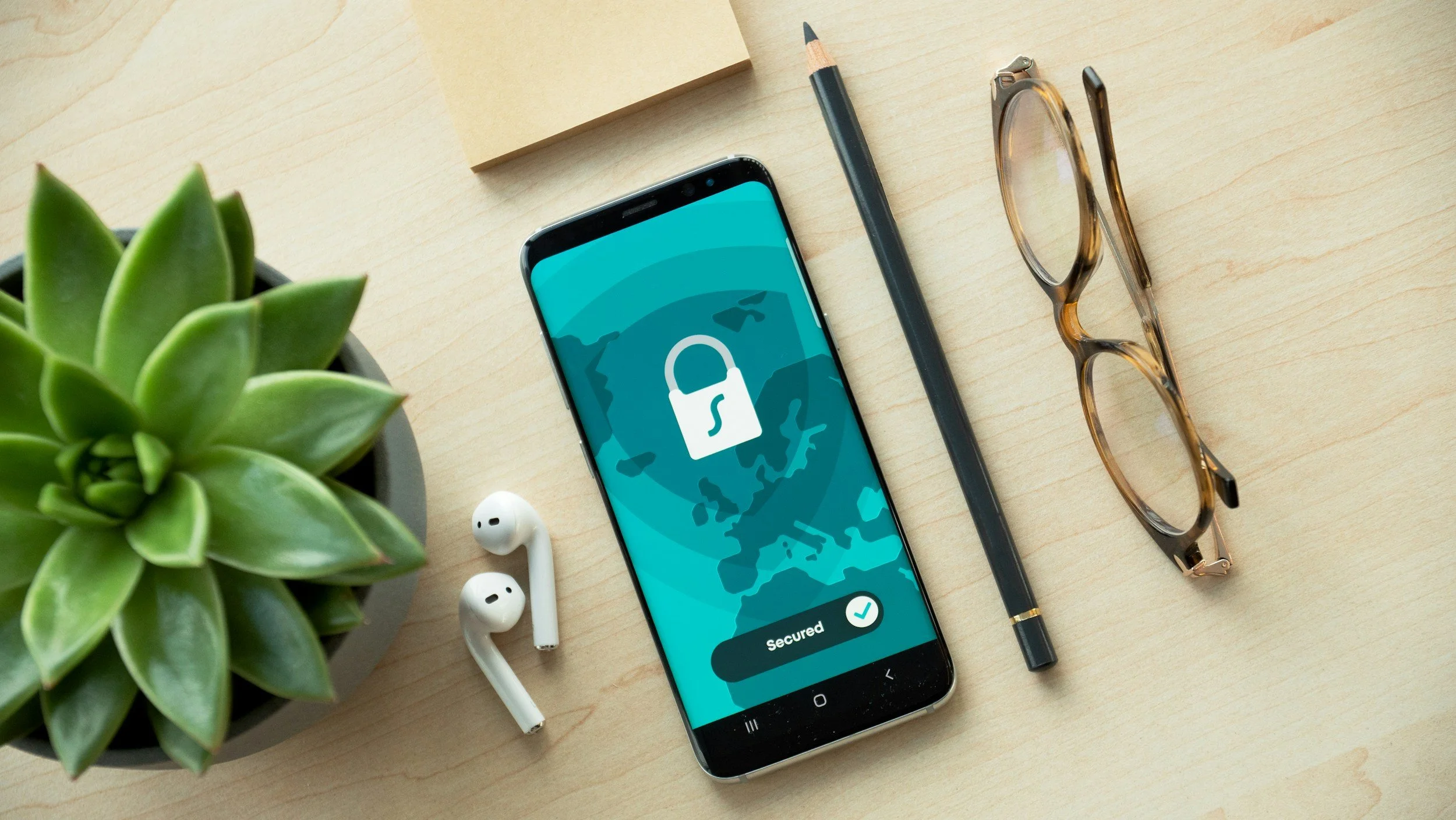
Great authentication ux makes security feel calm. It sets expectations, gives clients control and helps them recover quickly when reality happens.
what clients are trying to do
Most clients are not thinking “secure access”. They are thinking:
let me in quickly
confirm this is really me
do not make me guess what to do next
Design your login flow for those intentions and security will feel like a service, not a barrier.
1) explain what is happening in plain language
Avoid acronyms. Avoid jargon. Use words that match the moment.
good copy
“enter your email and password”
“we have sent a 6-digit code to your email”
“this code expires in 10 minutes”
“check your mobile for the access request”
avoid
otp, mfa, authentication factor, token
2) make the code step predictable
Clients hate surprise checks after they think they are done.
patterns that work
always show the same sequence: password then code
show why they are being asked: “for your security” in one short line
show where the code was sent, partially masked, so they know where to look
3) design for the real world: delays, mistakes, interruptions
Codes arrive late. People paste the wrong thing. They switch apps. They lose signal.
build in recovery
resend code, with a visible timer
change delivery method if available
a clear “use a different email” escape hatch if the client is locked out
preserve progress so the user does not restart from zero
If the system cannot resend immediately, say so and explain what will happen next.
4) treat “didn’t receive a code” as a first-class path
This is the most common failure point. It should not be hidden.
a good help path includes
check spam and junk folders
confirm the email address on file
wait guidance: “codes can take up to x minutes”
contact support with a visible phone number
Do not make clients guess. Make this a reassuring checklist.
5) use trusted devices carefully and transparently
Trusted device experiences can reduce friction, but only if clients understand and control them.
do this
explain what trusting a device means in one sentence
let clients view and revoke trusted devices
set an intentional trust duration and say what it is
warn clearly about shared devices
Security features that are invisible can feel suspicious. Visible control builds trust.
6) make error messages helpful, not vague
“We couldn’t verify you” is not enough.
good error messages
say what went wrong in plain language
say what to do next
keep the user’s place wherever possible
Example:
“that code has expired. request a new code and try again.”
7) accessibility matters at the front door
If login is not accessible, nothing is.
baseline expectations
keyboard friendly inputs and buttons
clear focus states
readable contrast
code fields that work with paste and auto-fill
error announcements that assistive tech can read
closing thought
In wealth apps, authentication is not just a technical step. It is a trust moment. Clients will tolerate security friction when it feels predictable and professional. If you design for clarity, recovery and user control, 2-step verification stops being rage-inducing and starts feeling like reassurance.